Part six of my conversation with Dennis G.
Dennis wrote -
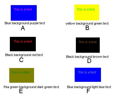
I haven't found any WEB sites that I have a big problem with so I created this MicroSoft PaintBrush bit map that has some text color combinations that I have arranged.

I had several normal vision people rate the readability of the combination and then I rated them myself. In order of readability here were the results from the two normal vision people.
Person #1
Person #2
Myself
It is interesting to note that the normals like the red on black, while I like the two shades of blue.
I mentioned I see further in the blue than normal people and hence my blue perception is above average. I have never read about colorblind people have better color perception in one region of the spectrum at the expense of another region. I have done other tests using special filters at work that show without a doubt my blue vision and color perception is above average. Note that the normal people like the yellow/green B combination. I have a difficult time just seeing the text and a WEB page with this color combination is totally unacceptable to me.
Like the normal vision people the two shades of greens are almost invisible to me. Note I made the people compare readability to seeing black and white text and reading a 100-page document. Let me know what you think of the color combinations. By the way with the people I tested and myself we all find the top three choices totally acceptable for a WEB page.
I find it very interesting that you have trouble reading the blue/gray text background combination.
I have never met a colorblind person that had trouble with combinations of blue. Tritan or, blue deficient, (blue-yellow) colorblindness is very rare. Could this explain your vision. You see all the primary colors, as I do, you see red , but you don't see red on black. Here is an explanation. Since red is considered a lack of blue in the brain then when you see red you aren't detecting the lack of blue because you are not sensitive to blue and so red on black goes to a dark gray on black and hence you don't see the text. Green stop lights look white to me because green is sort of a lack red, but I can't see the lack of red so my eyes see the yellow, green and blue in the light which mixes in my brain as a uniform spectrum of all colors. Hence I perceive the green light as white.
The same explanation using different colors can explain my (green deficient) friend as also seeing the green light white. The reason I can't see the green text on a yellow background is I think the brain tells green from yellow by the amount of red present. Since my RED reception is weak I have trouble telling the absence of Red. I see red as red just fine, its just dimmer to me than normal people.
In other words one has color perception difficulties at a region of the spectrum away from where they are deficient, but they have good color perception where they are cone deficient, they just are intensity deficient. For me red lights are red as can be, but they are weaker in intensity. You may see traffic light with equal intensity because you have may have normal Red and Green cones, but then traffic light don't involve blue so you see them fine. Just some guesses and comments.
After several months of research I think I am coming to some general conclusions about colorblindness. Hope you can read the bitmap I have enclosed.
Last updated March 5, 2001